List and Description of Aug Elements in the IDE
Overview
There are three distinct elements to every aug - pages, panels, and components. These elements can be further broken down into smaller subcategories, which will be covered in this chapter.
NOTE I: When adding components to pages, only name the components you want to have accessible from within your project. Every single named component is pulled into the data of your project, which allows it to send network messages, increasing latency and bandwith usage, leading to sub-optimal performance.
NOTE II: When naming components, ensure that there are no name duplications between named components. If name duplications occur, only the first instance of the component will run within your game.
Pages
Pages serve as the foundation of the aug - without pages, layouts cannot be set and components cannot be added, therefore an aug cannot be built. Just remember, as mentioned in section 2: Never have any pages without components!
Panels
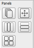
Panels serve as the layout sets for components and other panels within the aug. There are five different panel types available at present:
- Stack Layout
- Scrollable Panel
- Horizontal Layout
- Vertical Layout
- Grid Layout
The panels all have a “weight” assigned to them. A layout’s child elements are given “weights” within the layout, allowing them to take up different amounts of space within the layouts. The default weight of an element is set to 1, if undefined.
Panel Stack
A stack of panels placed on top of each other, rendering from first to last but processing events from the bottom panel to the top.
Panel Scrolling
A panel optimised for scrolling, with the size set in dp rather than px to ensure consistent image ratios across different screen densities. This panel also supports the pinch-to-zoom functionality, and only draws what is shown to optimise performance.
Panel Horizontal
A layout where components can be placed horizontally, alongside each other.
Panel Vertical
A layout where components can be placed vertically, below each other.
Panel Grid
A panel where components can be laid out in a grid of rows and columns - suitable for a quiz style layout.
Components
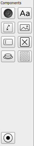
These components are added to the panels, and form the basis of the player’s interaction with the aug on their device.
Components also have the ability to have properties changed within the lua, during runtime. This can be done with the following line of code attached to the component:
component.[Component Name].[property to change]
Thumbstick
A thumbstick drawn from images or textures. Receives input either in the form of X and Y values, or A/R to simulate a true radial thumbstick experience.
Label
Used to place text into the design. You can choose to allow the text to autofit into the available space.
Touch Passthrough
This component is used primarily in embedded games. It is used to pass the touch values to the games by making the entire area of the device screen “touchable”, using several mapping systems, including a standard UV mapping system, to determine where touch input occurs.
NOTE: The Touch Passthrough component has different usages and behaviours depending on the development platform being used. A good example would be Construct2/3, where it used to allow the user’s input to pass to the native touch functionality built into Construct.
Image
Used to place an image into the design, to customise the aug. There are various image layouts available to help enrich the gaming experience.
Text Input Field
A place where the player can tap and input text. There are variations in text type available within the input field.
Toggle Button
A button that maintains its state when toggled, and can be styled from images to allow for greater customisation potential.
Button
A button which has a model for both a pressed and unpressed state. This can be used for game actions (such as an interact key, or a fire button), or for menu buttons. It can also be used to execute code within the game when pressed.
Area Fill
Used to fill an area with colour, which is drawn from code, allowing the colour fill to be dynamic.
Thumbstick Drawn
A thumbstick drawn using vectors and colours. Receives input either in the form of X and Y values, or A/R to simulate a true radial thumbstick experience.